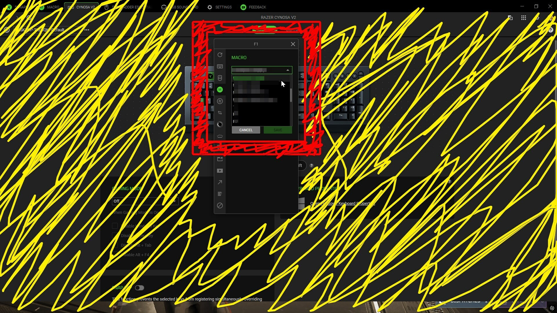
Picture attached.
added color to show wasted space for the tiny drop down window that only shows a short list of available macros.
When adding a macro to a hotkey is the drop down window Tiny for anyone else?
It’s annoying scrolling on that little window.
The macro list to pick from doesn’t even fill the window it sits in, there are more widgets to the left than what it can show for macros.