
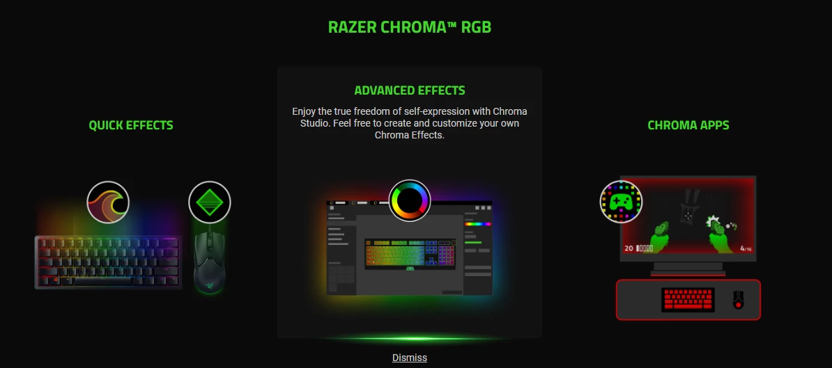

Chroma App UI/UX Note
- Community Cowboy
This topic has been closed for replies.
Sign up
Already have an account? Login
Log in with Razer ID to create new threads and earn badges.
LOG INEnter your E-mail address. We'll send you an e-mail with instructions to reset your password.