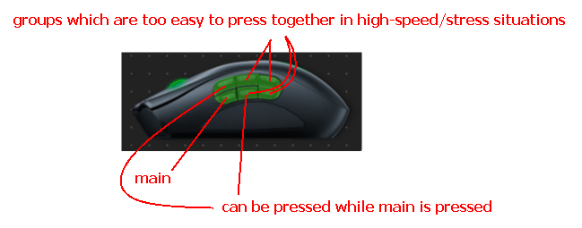
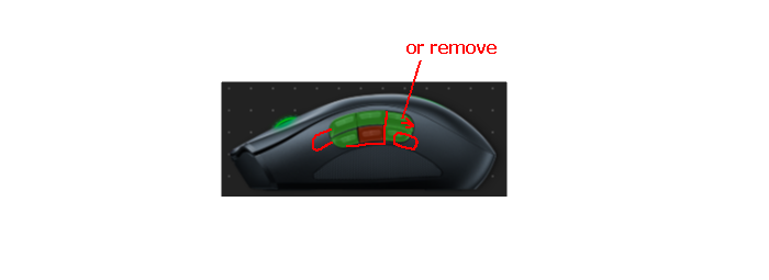
Buttons on the 6 and maybe 12 -buttons panels are not positioned reasonably .
In games, buttons on central and back columns are consistently pressed together, i disabled the back column but:
- its disturbing to have multiple buttons pressed when you execute 1 action .
- there is no reason to not shift the forward 2 columns more forward and separate the 3rd one alike columns on the 12-buttons panel are, but with more space between them . there will still be plenty of resting/holding space under the buttons .

For work, the middle buttons are unreasonably hard to press, adding space between the 2nd and 3rd columns will fix that .
I’m currently not using the 12-buttons panel and it will take time to analyze it, but due to its nature the issue is much larger with the 6-buttons panel .
p.s. the screenshot is of a work preset . on a gaming one, items of the back column are disabled/red .

